Kindsville
A website for kids to learn about kindness and parents/educators to impart kindness
Role
UI/UX Designer, UAT Testing
Client
Singapore Kindness Movement
Done With
Krome
Website
kindsville.kindness.sg01.-
PROBLEM STATEMENT
The brief was to revamp the Kindsville website and to increase engagement while creating a seamless experience for users.
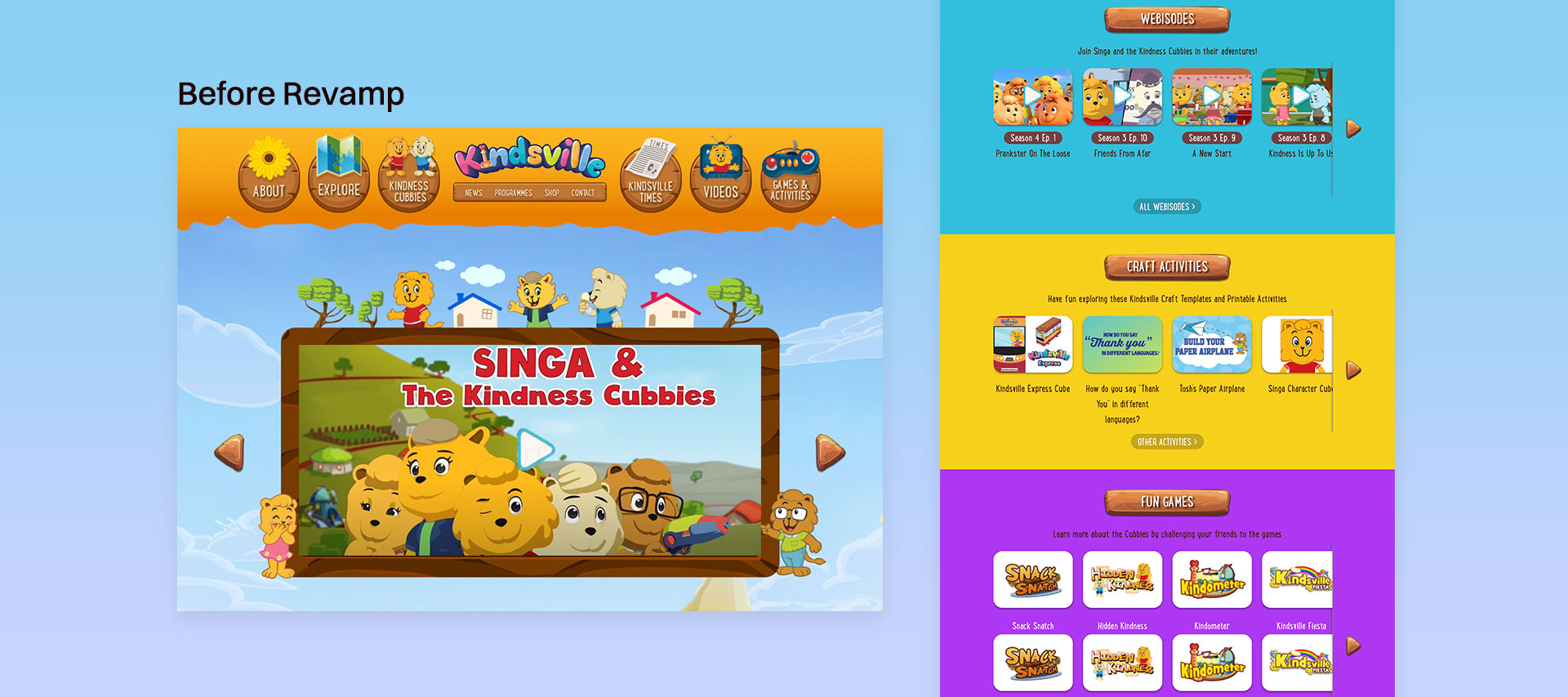
The current site is hard to navigate with 2 layers of menus and a dated appeareance so we had to modernise the experience.
02.-
COMPETITOR RESEARCH
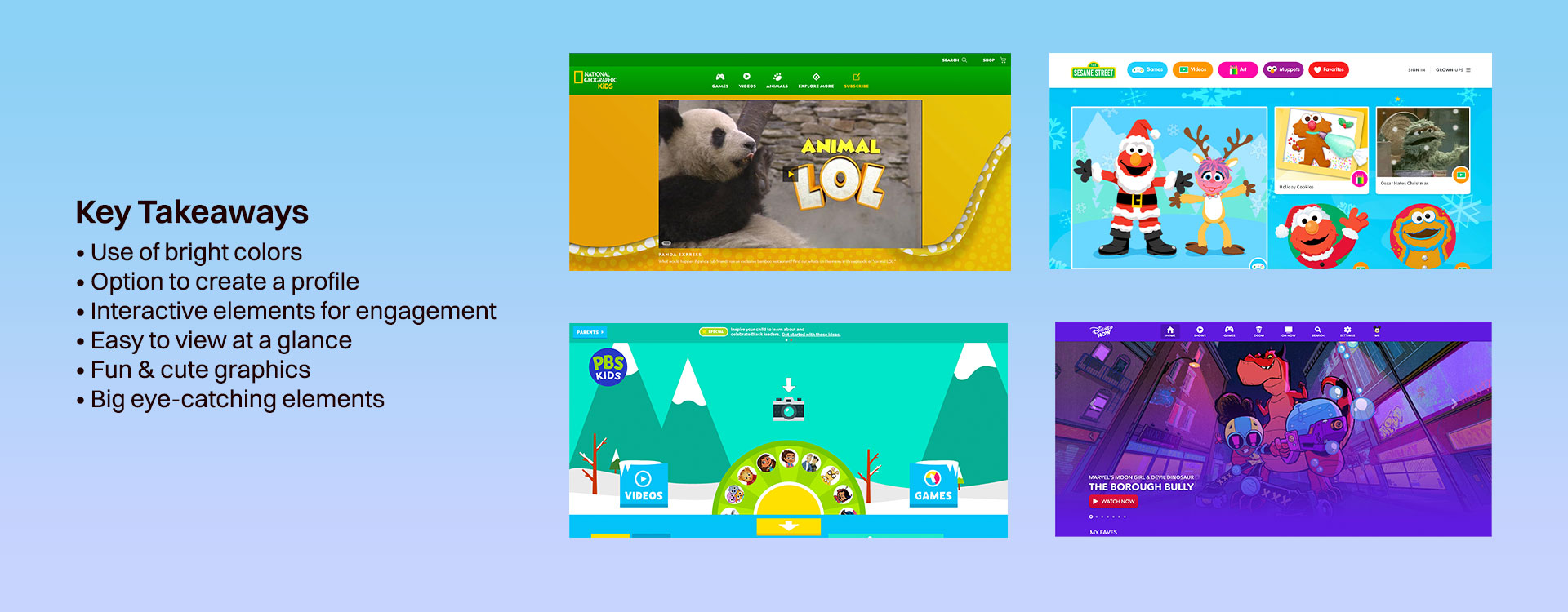
Researching how brands such as Disney, Sesame Street, and PBS Kids present content for children helped us gain insight into how to better capture kids' attention.
03.-
USER PERSONA
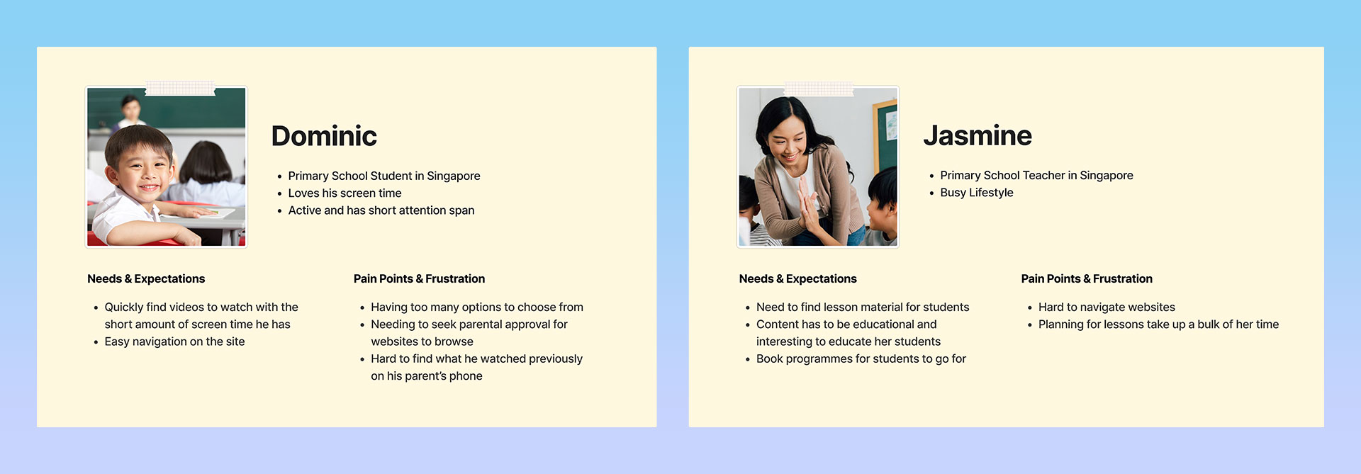
While Kindsville's main users are children, the website is also frequented by parents and educators for reading the latest news or enrolling their students in programmes.
In order to gain a deeper understanding of their specific needs and objectives, we created user personas for both groups.
04.-
Approach
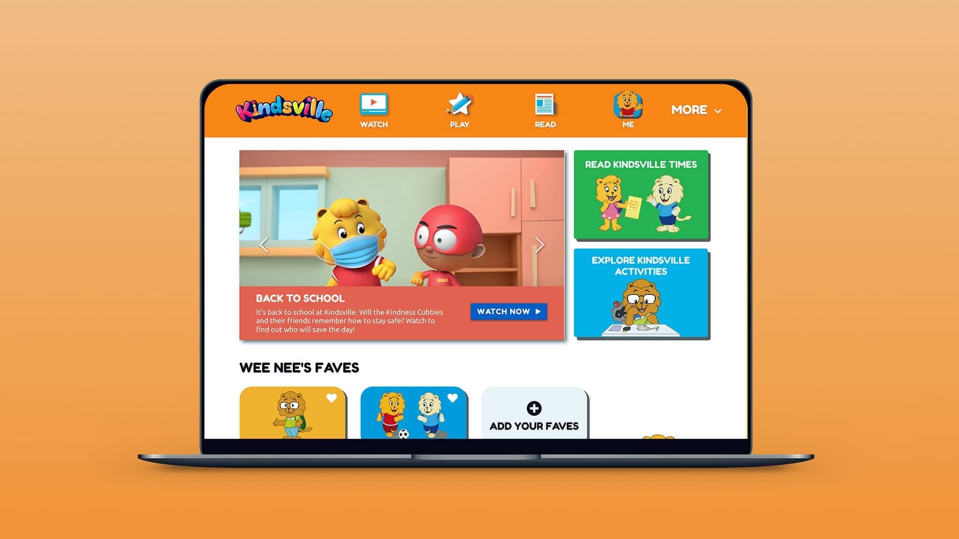
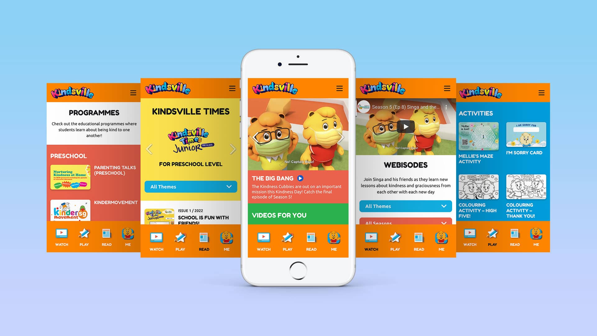
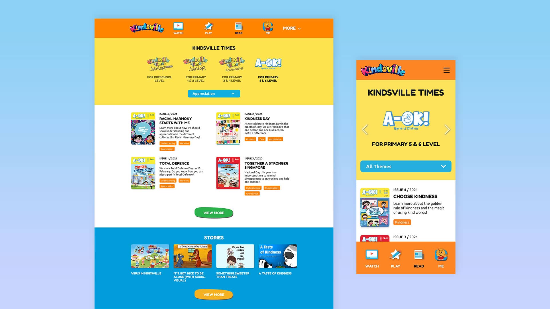
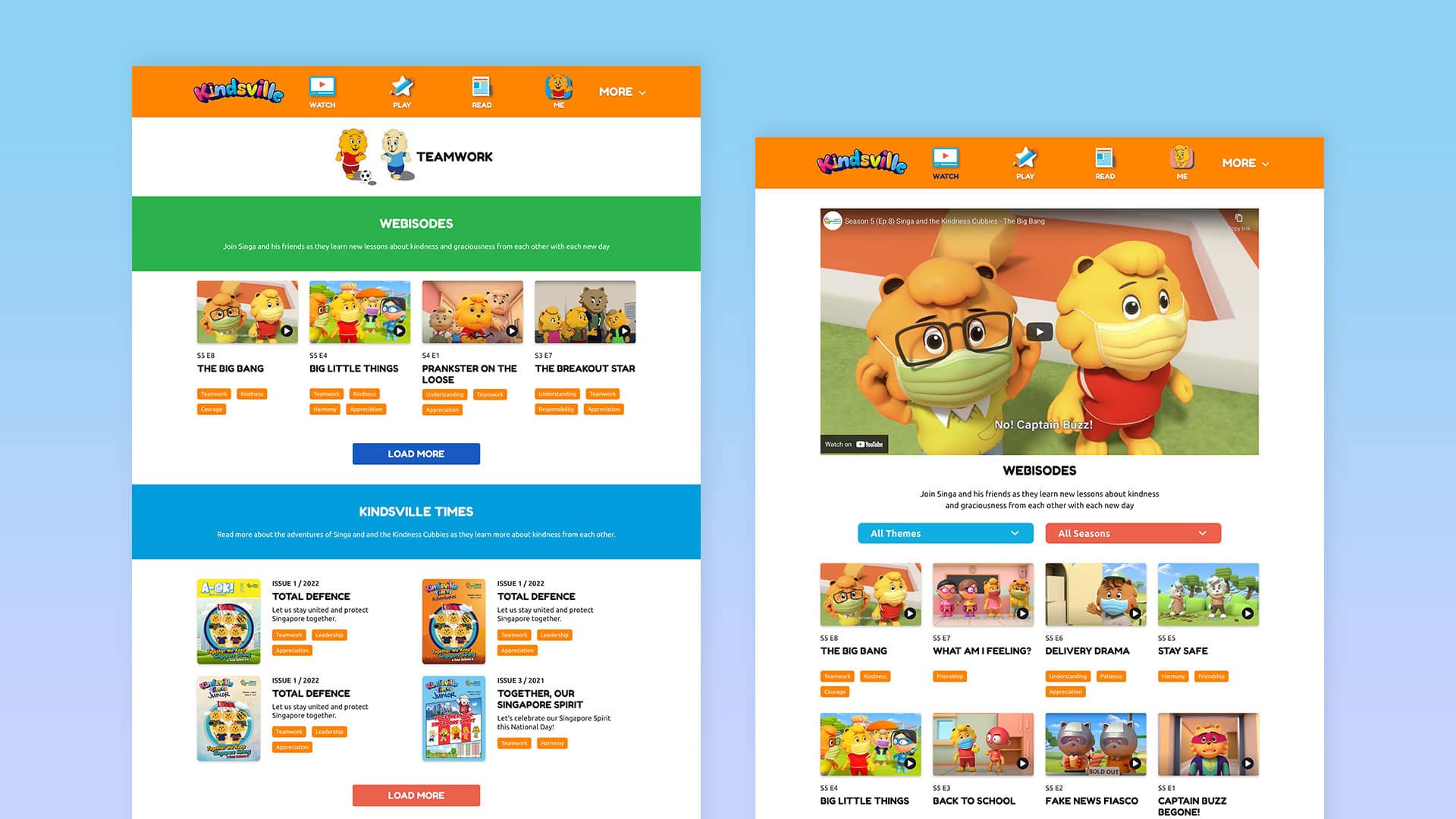
To ensure easy navigation for all users, including children who may be using their parent's mobile devices, we used a sticky menu with clear page categories.
Additionally, incorporating bright colors, sans-serif fonts, and the lovable Kindness Cubbies characters made the website more appealing and welcoming for kids.
05.-
Approach - Personalisation
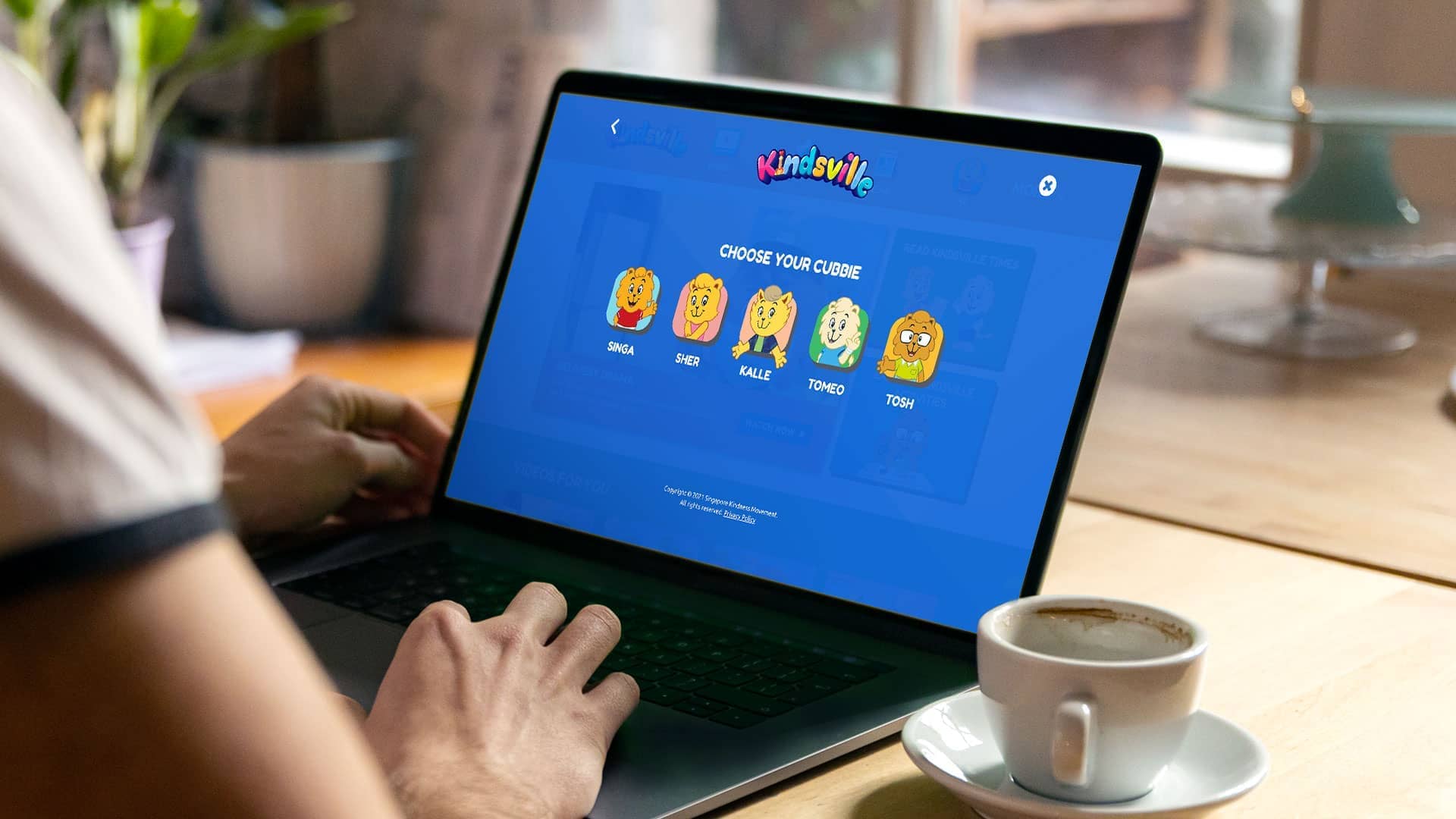
Users have the option to create their profile where they can personalise the site to their liking by choosing their cubbies and themes.
Based on their profile, Kindsville Times will show relevant content according to their age increasing engagement with users.


